


How The World Has Changed
Understanding Fiscal Vs Monetary Dominance

Secular shifts in asset markets are crucial to investment performance. They often arise from changes in the structure of liabilities in an economy that force compensating changes in asset values. The three most important secular shifts often involve: (1) inflation; (2) taxation and (3) demographics. At times, these changes also may be somehow linked together. For example, ageing populations may require higher taxation levels to afford greater health and social care, and, at the same time, they may lead on to high street price deflation, if traditional spending slows.
The clearest recent example of a past secular shift came when Chairman Volcker took the helm at the Fed in 1978 and, through a viciously tight monetary stance, squeezed high inflation out of the Western economies in the early 1980s. This launched a long-term bull market in financial assets. Asset allocations changed radically over the next two decades as a result. Investors swung from having large exposures to real estate and precious metals, towards more financial assets and notably longer duration bonds. The benchmark 60:40 portfolio mix between equities and bonds was born.
Today, markets probably stand at the beginning of a new threshold. We are in a ‘war economy’ simultaneously facing two foes: domestic demographics and China. Government outlays are already 40% higher than pre-COVID and slated to grow more rapidly as pressures from Medicare, social security and military defense build. Bond markets consequently face future huge funding demands. In practice, G7 governments can always finance themselves: the uncertainties are at what price and with what damage to other assets? We expect a looming threat from the monetization of large, embedded fiscal deficits and, consequent, faster inflation. It would seem that the widely popular 60:40 portfolio is not well-suited to these future times?
We detail in the box below more formal definitions of different monetary eras. Various monetary and fiscal policy responses are the common threads that define these regimes. We describe three such regimes: Monetary dominance, Fiscal dominance and Military dominance.

Monetary dominance describes a period when the Central Banks do not fund governments, and where governments act prudently with near balanced budgets. Monetary discipline is enshrined in a sustained low inflation rate and a stable currency. Fiscal dominance is almost the reverse. It occurs when the Central Bank is a slave to the government’s funding needs. The Central Bank (and sometimes commercial banks) is required to fund large deficits, and, hence, less able to stabilize inflation and the exchange rate. An era of monetary dominance is characterized by a business cycle that sees small rises and falls in inflation: this pattern sometimes benefits equities and sometimes bonds. Hence, during these times the near balanced mix in a 60:40 portfolio between stocks and bonds is favored.
In contrast, during periods of fiscal dominance the powerful trend in monetary inflation overwhelms cyclical movements. Hence bonds generally perform poorly and monetary inflation hedges like gold and (lately) Bitcoin do well. High street inflation likely (but not necessarily) picks up as the depreciation of paper money spills over. During the 1970s, the most recent prior period of fiscal dominance, real assets and precious metals unambiguously outperformed financial assets.
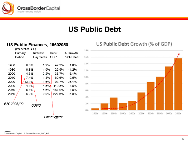
The slide below illustrates the impact that compounding interest payments can have in driving exponential growth in the burden of public debt as a share of GDP. Looking ahead, not only are primary budget deficits structurally large, but each ratchet higher in the debt/ GDP ratio adds to the burden of future interest payments. Public debt/ GDP is slated to test a whopping 230% by 2050, or double today’s rate, and annual public debt growth is set to clock in at over 15% of GDP.
There is little more to add about Military dominance. It is simply a more extreme and unrelenting version of fiscal dominance. Both manpower and wealth are conscripted.
Asset Allocation Implications of Monetary Inflation
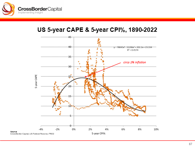
The scatter plot below uses data running back to 1890 and downloaded from academic Robert Shiller’s website. We have described the relationship before in our book Capital Wars (Palgrave, 2020). It shows the US market P/E multiple against the underlying 5-year rolling CPI inflation rate. The data trace out a hump-shaped or bell curve. This suggests that equities enjoy their highest valuations at around 2-3% CPI inflation rates. Either side of this region, higher and lower inflation/ deflation rates cause equities to de-rate lower.
Government bonds, in contrast, see a monotonic relationship with inflation: higher underlying inflation means higher yields (lower equivalent valuation multiples) and lower inflation means lower yields (higher valuation multiples). We should expect real assets (monetary inflation hedges) to have a similar but inverted relationship with inflation: higher (lower) inflation corresponds to the higher (lower) valuation of real assets.
We can depict all three trade-offs together on a single schematic asset allocation diagram. This shows how various inflation rates and inflation regimes affect prospective valuations and, hence, the ideal portfolio mix. Annotations on the diagram broadly identify different bond/ equity correlation patterns. Equities and bonds are often negatively correlated under low inflation regimes and positively correlated in high inflation regimes.
This differential pattern of correlation further explains why the 60:40 portfolio mix works well during monetary dominance regimes because these are likely associated with low high street inflation. However, it should be also clear that during periods of higher inflation, such as likely associated with times of fiscal dominance, holding bonds and equities will give poor diversification benefits. What’s more, bonds typically under-perform.
Under a fiscal dominance regime when monetary inflation is underway it makes more sense to switch from bonds into real assets in general. In the diagram we have suggested a 60:20:10:10 mix. This is not an investment recommendation: it is a discussion point and will not be appropriate for all investors. Nonetheless, it could illustrate how to avoid the worst excesses of the coming monetary inflation.
The portfolio mix has 60% in equities, as before. Equities are nominal assets that offer some inflation protection. 20% could be allocated to dedicated monetary inflation hedges, such as gold and Bitcoin. Another 10% could be put into TIPS (Treasury Inflation Protected Securities). 10-year TIPS currently yield over 2% after inflation, which historically is a decent real payback. The remaining 10% is allocated to cash. This currently looks attraction given 5% nominal yields

.
I agree. It is surely more than a coincidence that many Western countries face increased immigration, which has become a political issue yet never seems to be solved.
They typically outperform as economic cycle picks up. With rates having being held high for some long time small cap will have been hurt and this is being reflected in softer economy. So rate cuts should certainly help o/p