By far the most frequent question we are asked concerns the time-line that runs from our measures of Global Liquidity to their impact of different asset classes. The statistical analysis of financial data is never easy, both because many things often happen simultaneously and because the data is rarely stationary in a statistical sense, i.e. with stable mean and variance. On top, the arrival of alternative asset classes, such as Bitcoin, often creates new channels of influence, different feedbacks and inevitably short sample sizes. However, because the task is difficult, it is no reason to avoid trying to rigorously uncover these influences.
We report here the results from a VAR (Vector Autoregession) model that uses weekly data from 2010 onwards. Note that this period excludes the 2008/09 GFC. We do have monthly data stretching back to the mid-1960s, but we only began collecting weekly data in late-2009. Hence the data restriction.
VAR models allow us to better understand the dynamic response of an interconnected system and they can highlight the important pathways and key drivers or exogenous forces within the system. To ensure data stationarity, all variables are transformed into first differences, i.e. weekly changes.
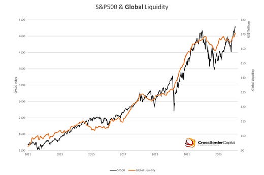
The following two charts plot the underlying data. The first chart tracks the co-movement between the S&P500 index and our measure of Global Liquidity. For the record, Global Liquidity (orange line) totals around US$170 trillion. It is defined as the balance sheet capacity of credit providers Worldwide. It includes traditional banks, shadow banks, repo market transactions and cross-border investment flows. Save to say, this is not M2 money supply. In many ways, our definition starts where conventional money supply measures end. We are more focussed on ‘money’ that circulates in the financial or asset economy.


